Inspiration
This design system is inspired by the work of Kazumasa Nagai, a Japanese graphic designer, and other poster art from the '60s onward. Clean, abstract forms reminiscent of HAL 9000, but in a benevolent manner.
Wave motif
Waves are the recurring generative gesture across jay.ai. A simple cellular field carries energy outward from a point, turning the same cool-to-warm palette into motion.
Color
The system has four color anchors, not fourteen independent colors. Signal blue, heat red, energy orange, and light yellow carry the identity. The other values are associated shades used to give waves depth and intensity. Product UI stays neutral and usually uses only one anchor at a time.
Signal blue
wave-blue-vividDepth, navigation, and cool wave polarity.
Heat red
wave-red-vividHeat, urgency, and warm wave polarity.
Energy orange
wave-orangeThe transition from heat into light.
Light yellow
wave-amberPeaks, highlights, and maximum energy.
Canvas
#000000Reading text
neutral-300Navigation
sky-300Typography
The stack is native system sans for speed and familiarity, with the platform monospace stack for tokens and small technical labels. Tight headlines meet relaxed body copy. The reading column is capped at 42rem (672px, max-w-2xl), matching the measure used by this page.
Intelligence in motion.
Build the sharpest version.
Software should feel immediate. Structure the page so the useful thing appears first, then let detail reward attention.
Supporting context stays present without competing with the work.
wave-orange #f97316Links
Navigation
Back controls preserve in-app history when it exists and fall back to a known route for direct visits. Primary tabs use a simple two-pixel underline without filled pills or heavy chrome.
Progressive image
Reserve the final aspect ratio up front, paint a tiny inline placeholder immediately, then fade in a responsive WebP. The full image is lazy-loaded and asynchronously decoded, so the reading experience never waits on it.
Image cards
Image cards use a golden-ratio image by default, carry media all the way to the card edges, and keep one-line titles with at most two lines of supporting detail. When an href is provided, the entire card behaves as one link.

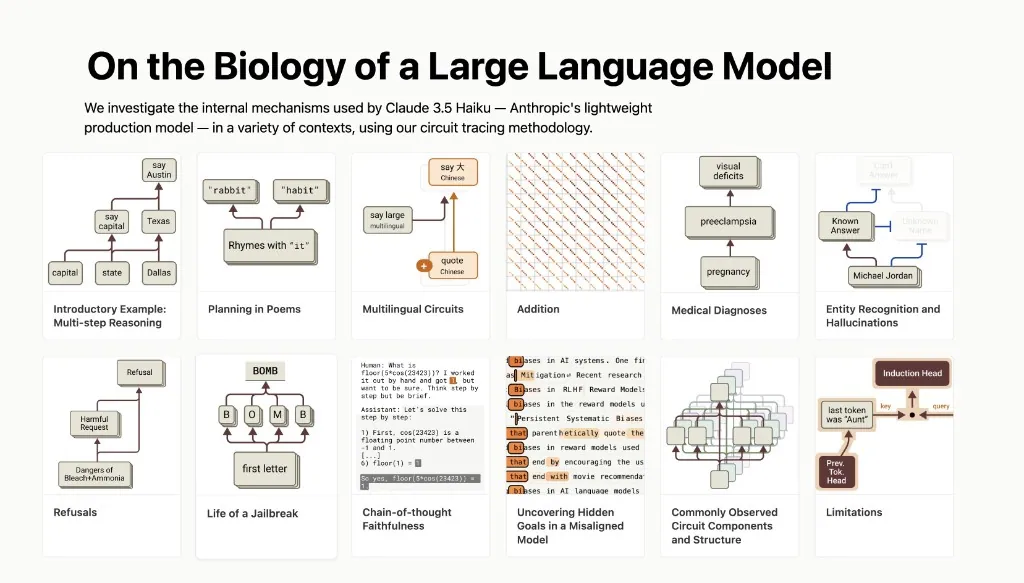
LLMs Are Not a Black Box
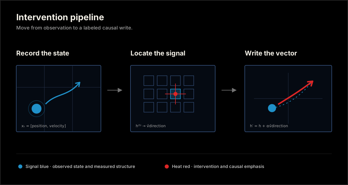
Intervention pipeline
Media rows
Media rows are full-surface links for editorial indexes. The preview moves to the right on wider screens and stacks below the text on mobile, with progressive loading and optional line clamping built in.
Diagrams
Treat diagrams as academic figures: use crisp SVG geometry, label every stage, axis, and series, and keep the composition minimal. Color must encode a stated meaning rather than act as decoration. Click either figure to inspect the original SVG.
wave-paper Primary labels, titles, and high-contrast values.
wave-blue-vivid Observations, measured structure, and primary series.
wave-red-vivid Interventions, causal emphasis, and comparison series.
neutral-700 Axes, guides, borders, and secondary structure.
Dividers
Quiet rules divide long-form sections without turning every idea into a card.
Strong
Code blocks
def fib(n: int) -> int:
    """Return the n-th Fibonacci number."""
    a, b = 0, 1
    for _ in range(n):
        a, b = b, a + b
    return a

print([fib(i) for i in range(8)])  # [0, 1, 1, 2, 3, 5, 8, 13]
Experiment registry
Register each run as a JSON record — slug, title, description, timestamp, optional metrics and checkpoint metadata — and render the registry with ExperimentIndex.
The 1.5 MB capacity cliff
• 2026-07-14A width-72, four-block transformer trained on the same passive Blocket League curriculum as the deployed model, with 10.27× fewer parameters.
The all-angle control
• 2026-07-18A matched 3.67M-parameter control trained from scratch on all puck-motion directions.
A 60° hole in motion
• 2026-07-21A 3.67M-parameter transformer trained from scratch after rejecting every 24-frame window containing due-east motion.
Collision physics without the upper-right
• 2026-07-26A 3.67M-parameter transformer trained after rejecting every 24-frame world crossing into the upper-right quadrant.
Live registry from the Blocket League lab.
[
  {
    "slug": "nano-1p5mb",
    "title": "The 1.5 MB capacity cliff",
    "description": "A width-72, four-block transformer with 10.27x fewer parameters.",
    "date": "2026-07-14",
    "metrics": [
      { "label": "12-frame error", "value": "4.98 px" },
      { "label": "64-frame error", "value": "19.10 px" }
    ],
    "meta": { "preset": "nano", "parameters": "357k" }
  }
]import { ExperimentIndex, ExperimentPage, parseExperiments } from "@jayhack/wave-kit";
import registry from "@/experiments.json";
const experiments = parseExperiments(registry);
// app/experiments/page.tsx — the index
export default function ExperimentsPage() {
return <ExperimentIndex experiments={experiments} />;
}
// app/experiments/[slug]/page.tsx — one page per record
export default async function Experiment({
params,
}: {
params: Promise<{ slug: string }>;
}) {
const { slug } = await params;
const experiment = experiments.find((entry) => entry.slug === slug)!;
return (
<ExperimentPage backHref="/experiments" experiment={experiment}>
{/* Free-form body: figures, rollouts, experiment-specific code */}
<RolloutViewer slug={experiment.slug} />
</ExperimentPage>
);
}Style guide
Simplicity is an editing discipline. Every visual element should improve meaning, navigation, or reading rhythm.
Remove ornamental UI
Avoid AI slop such as eyebrows, sequence numbers, badges, and labels that only repeat nearby content. If an element adds no information or function, remove it.
Keep titles in proportion
Use the smallest title that establishes hierarchy. Avoid oversized hero text that pushes useful content below the fold or turns every page into a landing page.
Compose for vertical reading
Structure pages like blog posts when possible. Assume vertical scrolling, use semantic sections and paragraphs, and intersperse images or interactive assets with the text they support.
Code samples
Install the package, import the global stylesheet once, then compose the real components. These examples are complete enough for an agent to copy into a React or Next.js project and adapt without recreating the design system.
@import "tailwindcss";
@import "@jayhack/wave-kit/styles.css";import { NavigationIndex, WaveField } from "@jayhack/wave-kit";
const sections = [
["overview", "Overview"],
["details", "Details"],
] as const;
export function ProjectPage() {
return (
<div className="min-h-screen bg-wave-ink text-wave-body">
<div className="mx-auto w-full max-w-[78rem] px-5 py-10 sm:py-16">
<div className="min-[72rem]:grid min-[72rem]:grid-cols-[minmax(0,1fr)_minmax(0,42rem)_minmax(0,1fr)] min-[72rem]:gap-8">
<aside className="hidden min-w-0 min-[72rem]:block">
<div className="sticky top-1/2 -translate-y-1/2">
<NavigationIndex items={sections} />
</div>
</aside>
<main className="mx-auto min-w-0 max-w-2xl min-[72rem]:mx-0 min-[72rem]:max-w-none">
<section id="overview">
<div className="relative aspect-[16/7] overflow-hidden rounded-lg bg-wave-ink">
<WaveField className="absolute inset-0 h-full w-full" />
</div>
</section>
</main>
<div aria-hidden className="hidden min-[72rem]:block" />
</div>
</div>
</div>
);
}"use client";
import { useState } from "react";
import { Lightbox, ProgressiveImage } from "@jayhack/wave-kit";
const images = [
{ src: "/project-full.png", alt: "Project system diagram" },
];
export function ProjectImage() {
const [open, setOpen] = useState(false);
const [previewSrc, setPreviewSrc] = useState<string>();
return (
<>
<button onClick={() => setOpen(true)} type="button">
<ProgressiveImage
alt={images[0].alt}
height={900}
onLoad={(event) => setPreviewSrc(event.currentTarget.currentSrc)}
src="/project-1024.webp"
srcSet="/project-672.webp 672w, /project-1024.webp 1024w"
width={1024}
/>
</button>
{open ? (
<Lightbox
items={[{ ...images[0], previewSrc }]}
onClose={() => setOpen(false)}
startIndex={0}
/>
) : null}
</>
);
}<div className="border border-wave-blue-vivid bg-wave-ink text-wave-paper">
<span className="text-wave-amber">High energy</span>
</div>import { CodeBlock } from "@jayhack/wave-kit";
<CodeBlock
code={'const energy = "wave-orange";'}
label="Theme token"
language="tsx"
/>import numpy as np
def fit(xs, ys):
# least-squares slope and intercept
slope = np.cov(xs, ys)[0, 1] / np.var(xs)
return slope, ys.mean() - slope * xs.mean()Tech stack
Wave Kit is designed for a focused application stack: Next.js for the React framework, Vercel for deployment, Tailwind CSS for named design tokens and composition, and shadcn/ui for accessible primitives when a project needs controls beyond the core kit.
Install
Install the public package from npm. Use the GitHub checkout when contributing to Wave Kit itself.
npm install @jayhack/wave-kit tailwindcssgit clone https://github.com/jayhack/wave-kit.git
npm install ./wave-kit/packages/wave-kit tailwindcss@import "tailwindcss";
@import "@jayhack/wave-kit/styles.css";Research note · 8 min read
What the model learns between frames
EditA small visual study of how motion emerges inside a video model. Click the title or this paragraph to try the editable states.
EditA model never sees motion directly. It sees a sequence of still images and learns which changes tend to follow others. The useful question is not whether it memorized pixels, but where a stable representation of direction begins to appear.
The gap between two frames is where the model has to invent a theory of the world.
const probe = trainLinearProbe({
  layer: 8,
  target: "motion_direction",
});
This is a visual sandbox, so edits reset when the page reloads and nothing is written to the blog source.